top of page
A La Carte
A social food app that helps people find local street vendors

Project Vision
Design a mobile food application that
locates street vendors
My Role
Product designer and Product manager
Team
Silvia Kim, Kristin Lin, Abhinav Kannan, Juno Park, Jason Zhen
Background
This was originally a hackathon idea where our team won the Most Innovative Award and 2nd place for People’s Choice Award. Due to geographical differences, it was difficult to continue to develop this product together. So I decided to further explore the problem and go through the entire design process in a Product Management course with a different team.
Problem Space
Often it can be difficult to identify when and where street vendors set up. For people looking forward to eating street food, it is crucial to first locate the cart.

Design Question

Solution
We designed A La Carte, a mobile food application that empowers our users to confidently identify the business activity of street vendors, such as the location and whether they are working or not. In addition, it offers an option to pay online if users forget to bring cash.
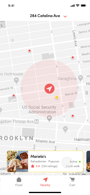
Vendor Activity and Location
All the information you need to need to identify when and where vendors are posted
No more confusion! Find the nearest vendor to you with gps and whether they are in business hours with the green active button signal.
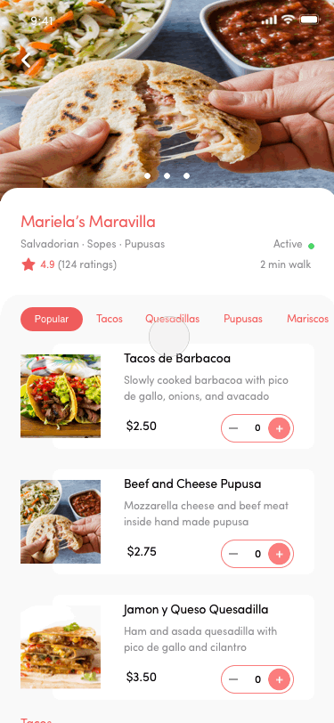
Menu Items At A Glance
See what each vendor offers!
Quickly scan the variety of menu items of vendors. Option to add items to your cart.
Online Payment Option
Enjoy local street food without missing out!
No Cash? No Problem! Often times we miss out on delicious street food because the establishments accept cash only. With
A La Carte, you have the option to pay online!
Design Process
Research
Market Analysis
Competitive Analysis
Interviews
Affinity Map
Personas
Design
Features Brainstorming
Sketching
Wireframe
High Fidelity Mockup
Interactive Prototype
Evaluate
Usability Testing
Product Pitch
Design Iterations
My Contribution
As the product designer of the team, I advocated for conducting user interviews and encouraged brainstorming sessions to be done as a whole team to include input from everyone in the team. I created all deliverables which include wireframes, high fidelity mockups, interactive prototypes, and promotional product flyers.
As the product manager of the team, I listened to the engineering and business constraints and possibilities. I ensured all team members understood and contributed to the project.
After the course and project came to an end, I decided to refine the design on my own by taking the user feedback and iterating multiple times on it.
Market Analysis
We conducted a general industry market opportunity data on street vendors in the United States alone. As a product development standpoint, we felt it was crucial to gauge our stance in the specific industry we are diving in.

Interviews and Affinity Mapping
To better understand how consumers and vendors navigate the street food landscape, we conducted seven interviews with two street cart vendors, two food cart vendors, and three buyers. After the interviews, we organized our results by conducting affinity mapping.

Research Findings

Research Findings : Pain Points

Interview Challenges
One challenge we faced while interviewing food truck vendors was catching them at a time when they were not busy. We anticipated that they would be busy during rush hours (typically around noon) when more people show up for lunch. Also, recruiting vendors willing to spend 20 minutes of their time in interviews was difficult because they had to tend to their workstation.
The interview practice that was most difficult to follow was finding an allotted time frame to conduct the interview. Since we were interviewing vendors while they were working or setting up, our interviews were sometimes interrupted by customers in various ways. For interviews conducted in Los Angeles, we received feedback that interviews would break every now and then because of incoming customers. Also, compared to food truck vendors, there were more interruptions when interviewing food cart vendors.
Personas
By collecting data from our user research interviews, we identified the particular characteristics that make up our users. So we made three provisional user personas that best describe our type of users to better guide our design and help everyone on the team empathize with our users.


Design Goals
Through the research findings and user personas, we identified our main goals
-
Visibility for vendors --- to attract more customers
-
Accessibility for customers --- to be able to locate vendors
Product Decision
Moving forward, we decided to focus on the consumer flow for this project because of two reasons:
The first is because this was a semester project with limited time, we wanted to focus on the quality of one well. And we realized that to pitch this idea we needed to focus on the consumer facing platform where we could reach a wider crowd.
Features and Prioritization
Based on the research and developed personas, we narrowed down the features we wanted A La Carte to have to reach our design goals.
-
Have information about the availability of the vendor
-
Have a map where people can quickly scan nearby vendors
-
Have an online payment option
Brainstorm and Ideate
As a team, we brainstormed different platforms we can use to address these pain points. We decided it is best to move forward on a mobile platform because it has a convenient GPS capability necessary for our idea.
Sketches
I quickly dew out sketches to explore different ideas and to confirm the direction with the team.


Prototype


Wireframe
We narrowed down the sketched ideas and transferred them digitally to create wireframes.


User Testing
We tested our prototype with real potential users such as foodies and students. We hypothesized that users would be willing to use the platform because of their familiarity with Yelp and other food applications. However, there were some mixed reviews about this app idea where some where excited about this and some questioning the difference between Yelp and this.
Feedback and Refined Features
After conducting user testing, we gathered feedback on some of the confusion of the application
-
Map Vendor Association --- It was confusing for users to connect the vendor card on the bottom with the dot on the map and vice versa
-
Menu Navigation --- There was friction to view the whole menu
-
Item Selection --- Too many levels to get to select an item
-
Unused Tabs --- The Favorite and Profile tabs were rarely used
Iteration
By the time we tested it, it was the end of the semester so the team had no obligation to continue to work on the product. However, I was passionate about this idea so I went ahead and continued to iterate on the design. While redesigning based on the feedback, I also decided to change the color to something closer to red as it envokes hunger.


Design Decision
Based on the user feedback on the initial iteration, I demonstrate a side by side comparison of the changes that I made and the reasons behind.
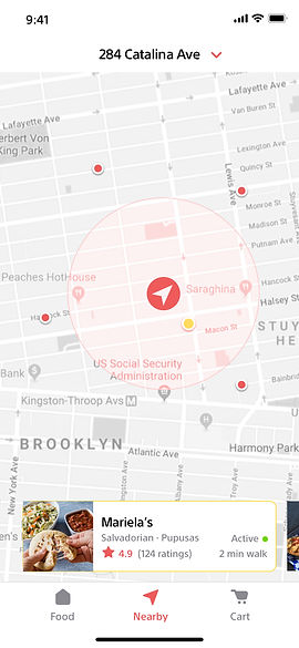
Map: Vendor Association
One of the confusion lied on the map screen where users could not tell which vendor card was associated with which dot on the map and vice versa. So I decided to have the the associated dot and card be the same color. In addition, I added a radius around where the user stands to easily identify the nearest vendor.
Before

Whitespace makes the color and words more readable. Replaced with capsule filter for consistency with style.
Easily identify nearest vendor in vicinity
Yellow theme on card and point makes it easy to associate them as the same.
Favorite and profile tab rarely tapped.
Location icon on tab and map inconsistent.
After

Simplified to three main actions
Menu Navigation and Item Selection
Another feedback was that there was too much friction to view the whole menu and select items.
Before
After


Scroll
Click
Item selection within the menu
much more convinient
Information Placement
Although there was no feedback on the vendor card, as a designer, I thought it needed to be reorganized to best showcase the information regarding the vendor by dividing them into respective category.
Before
After

Replacing multiple star icons with a number that represents one icon increases readability and clears up space
Dividing restaurant information into separate category allows for better readability
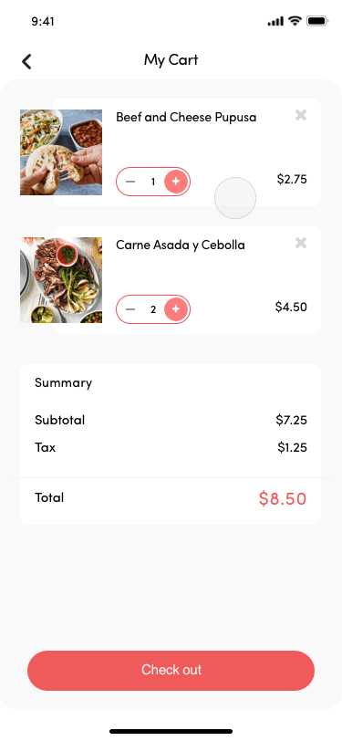
User Testing: Here We Go Again
In order to validate the redesign, I decided to conduct another round of user testing. Most of the feedback was very positive. The only roadblock for testers were that they were unable to increase, decrease, and remove items. So with this feedback, I changed the 'add to order' button with a multifunctional button that can add and subtract however much quantity. In addition, I added a remove action on the item card for more control for the user.
Before

After
Can freely add or subtract however much

User more in control of their items before checking out

Value Proposition
When looking ahead from a larger product perspective, A La Carte encompasses a twofold platform for two type of users. A La Carte eliminates confusion for buyers by helping locate nearby street food vendors and provides vendors with tools necessary to attract more customers. And the main attraction is that it will connect these two users.

Future Development
-
Explore the vendor flow and what that looks like to complete the vision of this street food ecosystem.
-
Tip option for buyers. This is for buyers who want to further support the vendors.
Reflection and Takeaways
I learned how to engage within a multi-disciplinary team and developed the ability to de-scope features to deliver high quality deliverables.
It was definitely difficult being both the designer and product manager. I was responsible for designing all the deliverables, constructing the pitch, and making sure everyone in the team was on the same page. It was very stressful at times but it was such an amazing experience working with other peers who are passionate in my idea.
Check out other projects!

Trust the process.
Gift wisely and confidently.
Gifti
The jacket that has your back
Eyeris
or
bottom of page